All work

UX Research · Information Architecture

The library had everything.
Users couldn't find any of it.

Research-led IA redesign for one of America's 10 largest public library systems.

81 locations. Two top-level nav categories for everything. I led research and architecture — validated by 45 participants before a single wireframe.

UX ResearchInformation ArchitectureTeam ProjectUniversity
13
Card sort participants
32
Tree test participants
4
Task flows validated
81
Library locations
FigmaFigJamOptimal WorkshopCard SortingTree Testing

The problem

2 nav categories.
Everything buried.

The CPL site organized everything — printing, research help, language support, children's programs — under Browse and Events. The content existed. The structure didn't.

Before

  • Only 2 top-level navigation categories
  • Services buried under unrelated sections
  • No audience-based navigation
  • Language toggle hidden in account settings

After

  • 6 intent-driven top-level categories
  • Every service findable in under 3 clicks
  • Kids / Teens / Adults audience filtering
  • Language toggle persistent at homepage level

Who I designed for

Two users.
Same broken nav.

Personas developed from content inventory — their needs and frustrations anchored every structural decision.

Bruce persona card — graduate student
Bruce, 23 · Graduate Student
Rachel persona card — immigrant grandmother
Rachel, 54 · Immigrant Grandmother

What I did

Not what I assumed.
What they actually did.

Card Sorting

Closed card sort — 13 participants

Tool
Optimal Workshop
Participants
13
Avg time
2 min 53 sec

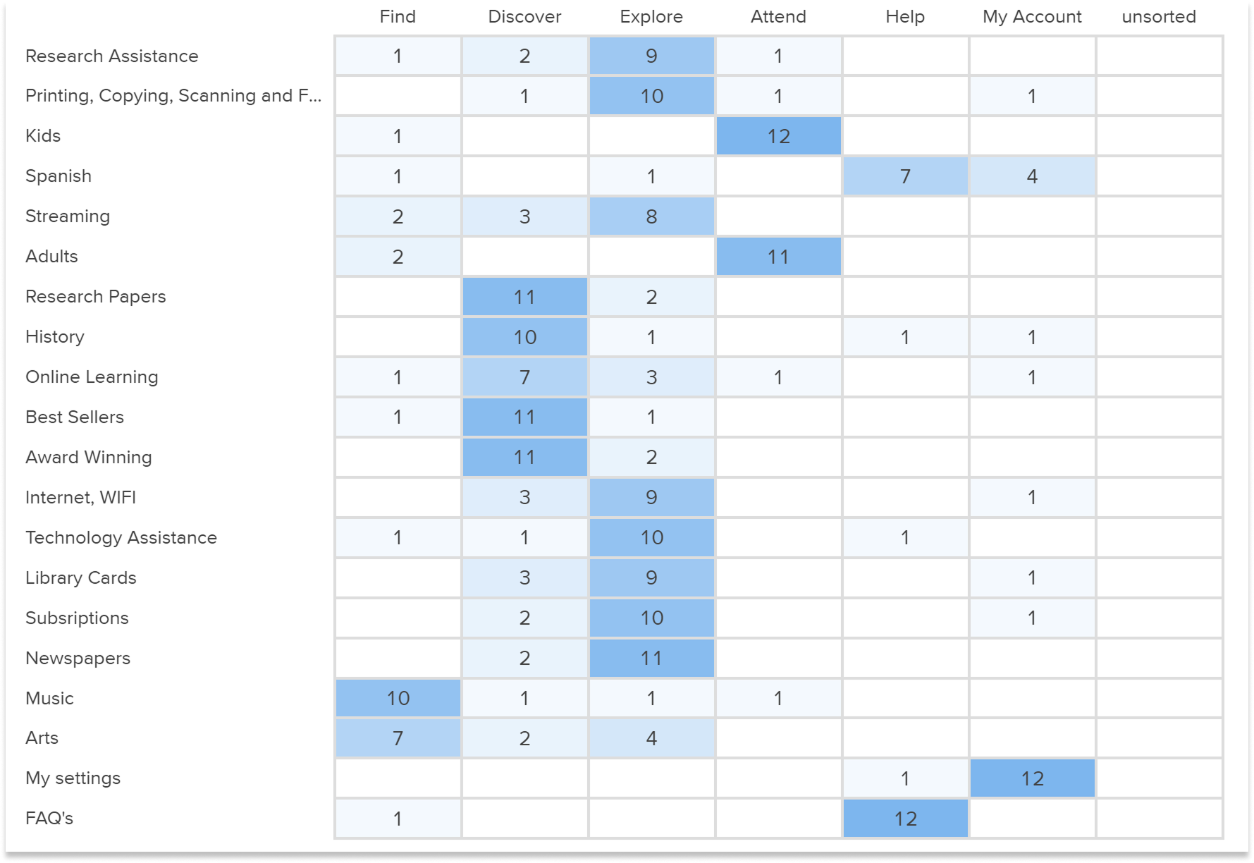
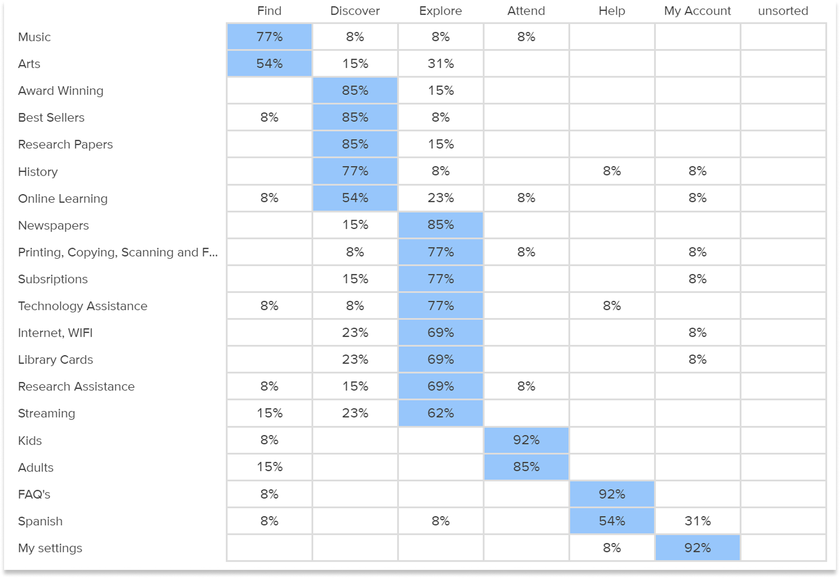
Tested whether my proposed nav categories matched users' mental models. Strong alignment on Tech Services and Attend — with one unexpected pattern.

Users consistently grouped "Spanish language resources" under both Find and Help — revealing the language access ambiguity that later drove a dedicated nav decision.

Tree Testing

4 task scenarios — 32 participants

Tool
Optimal Workshop
Participants
32
Avg success
60%

Validated the proposed sitemap with persona-driven scenarios — before any visual design began.

75% directness on tasks that succeeded — users who found the right answer took the direct path. Failures were in labeling, not structure.

Card sorting results matrix showing raw counts per category
Results matrix — count of cards sorted per category
Popular placements matrix showing percentage of participants per category
Popular placements — % of participants per category

What the data showed

Four real scenarios.
Three structural fixes.

Each task mapped to a persona's core need. Every finding under 70% drove an architectural decision.

Bruce
53%Success
66%Direct

"You need help with your research paper."

Lowest success rate. Users looked under Help — not Resources. A labeling failure, not a structural one.

Decision → Elevated Research Assistance to top-level Help. Decision driven by data, not assumption.

Rachel
59%Success
75%Direct

"English isn't your first language. Find the Spanish version."

Language toggle was buried in My Account. Non-English speakers gave up at the homepage — a critical accessibility gap.

Decision → Surfaced language selector to homepage level — persistent and visible, not nested.

Rachel
59%Success
75%Direct

"Find a suitable event for your grandchild this weekend."

Kids' events mixed with all events — impossible to scan without filters.

Decision → Added Kids / Teens / Adults audience filters visible from the Attend top-level nav.

Bruce
69%Success
59%Direct

"You need to make copies of your resume."

Users found printing under Tech Services. Path was correct — label needed clarification.

Decision → Renamed to "Print & Copy" — intent over category name.

Task 02 · Task 0353% · 59% success
1 / 2
Task 02 — Research paper help, 53% success
Task 0253%
Task 03 — Spanish language, 59% success
Task 0359%
Task 04 — Kids events, 59% success
Task 0459%
Task 01 — Printing services, 69% success
Task 0169%

What changed

2 categories → 6.
Every decision earned.

Each of the six categories maps to a user intent identified in research — not a content type, not an org chart. Amber items below were structurally changed based on task failures.

New top-level navigation

FindResources, databases, digital collections
DiscoverNew books, staff picks, recommendations
ExploreResearch tools, subject guides, archives
AttendEvents filtered by Kids / Teens / Adults
HelpPrint & Copy, research assistance, tech services
My AccountLanguage toggle — now persistent + visible

Full sitemap + wireframes on Behance

All 6 categories, sub-levels, and annotated wireframes — open in Behance →

View on Behance

Research broke every assumption.

53% success on Task 02 flagged a critical failure before a developer touched a line of code. That's why you run the study first.

Full deliverables — card sort matrix, tree testing paths, and final sitemap — on Behance.

"The problem wasn't missing content.
It was missing structure."

UX Research · Information Architecture · Optimal Workshop · 45 participants · 4 validated task flows